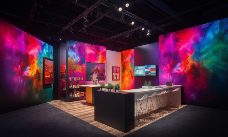
Harnessing the Power of Color Psychology in Exhibition Stand Design

Color is one of the most impactful tools in exhibition stand design, influencing visitors’ perceptions, emotions, and behaviors within seconds of viewing. Understanding the psychology of color can help brands create exhibition stands that not only attract attention but also communicate their values, evoke desired emotions, and encourage meaningful engagement. Whether you are an exhibition stand builder or a business owner planning your next trade show display, strategic color choices can significantly enhance your results.
The Science Behind Color Psychology in Exhibition Stands Design
Color psychology studies how colors affect human emotions and behavior. Colors trigger subconscious reactions, shaping how people perceive brands and environments. For instance, red is often associated with excitement and urgency, while blue evokes feelings of trust and calm. When applied to exhibition stands, these associations can be leveraged to align with your brand identity and desired visitor response.
In the context of trade show displays, the right colors can help differentiate your stand from competitors, draw visitors in, and guide them through your space. Poor color choices, however, risk creating confusion or disinterest, undermining the effectiveness of your stand design.
Practical Tips for Using Color Psychology in Exhibition Stand Design
1. Align Colors with Your Brand Identity
Your exhibition stand is an extension of your brand. Ensure the colors used in your exhibition stands design align with your logo, website, and overall branding. Consistency reinforces brand recognition and trust. For example, if your brand emphasizes innovation and trust, shades of blue might be ideal. Conversely, if you aim to project energy and excitement, bold reds or oranges could work better.
2. Consider the Emotional Impact of Colors
Different colors evoke specific emotions. Understanding these associations can help craft the mood of your stand:
- Red: Passion, energy, urgency. Use it sparingly to draw attention to key areas.
- Blue: Trust, dependability, calmness. Great for professional or corporate brands.
- Yellow: Optimism, warmth, happiness. Ideal for stands aiming to inspire or uplift.
- Green: Health, nature, balance. Perfect for environmentally conscious brands.
- Black: Sophistication, elegance, power. Suitable for high-end or luxury products.
Combining complementary colors can add visual interest and balance, while overloading your display with too many colors might overwhelm visitors.
3. Leverage Color to Guide Visitor Behavior
Color can subtly guide visitors’ movements and interactions. Bright, contrasting colors can draw attention to focal points such as product displays or interactive stations. Softer hues can create areas for rest or casual conversation, encouraging visitors to linger and engage more deeply.
Consider using floor graphics or signage in distinct colors to direct foot traffic through your space. A cohesive color strategy ensures visitors experience your stand as intended.
4. Adapt to Trade Show Environments
The setting of a trade show influences how colors are perceived. Exhibition halls often feature neutral or dim lighting, which can alter the appearance of colors. Choose vibrant, high-contrast colors that stand out under these conditions. Working closely with an experienced exhibition stand builder can ensure your stand’s design remains impactful regardless of the venue.
5. Test and Optimize
Before finalizing your design, create mockups to evaluate how your chosen colors work together. Testing allows you to identify potential clashes or areas that lack visual impact. Some exhibition stand builders offer 3D visualization tools to help you see how your stand will look in the real world, making refinements easier.
Examples of Effective Color Strategies in Trade Show Displays
- Minimalist Monochrome: Using shades of a single color, like white or gray, can create a clean, modern look. This strategy works well for tech-focused brands aiming for simplicity and sophistication.
- Bold Accents: A neutral base with bold accent colors, such as black with pops of yellow, can emphasize key elements while maintaining a professional aesthetic.
- Nature-Inspired Palettes: Greens and browns evoke eco-consciousness and sustainability, ideal for brands promoting natural or organic products.
The Role of Professional Design in Color Selection
While understanding color psychology is essential, effectively applying it to exhibition stands design requires expertise. Professional exhibition stand builders understand how to integrate color with lighting, materials, and layout to create a cohesive and impactful display. Their knowledge of trade show environments ensures your stand will be both visually striking and functionally effective.
Conclusion
Color psychology is a powerful tool in exhibition stand design, capable of shaping visitor perceptions, driving engagement, and amplifying your brand’s message. By strategically choosing and combining colors that align with your goals, you can create trade show displays that leave a lasting impression on attendees. Collaborate with an experienced exhibition stand builder to bring your vision to life and ensure your stand becomes the highlight of the event.


